History Tool (2006)
Note: for confidentiality reasons, parts of the
interfaces have been obfuscated.
Process
I was given the project of designing and leading the development of a tool
that would help users define relationships between different documents. This
was a large scale project involving several thousand requirements and multiple
teams of developers over the course of several years. Because of the complexity
of the UI, I determined we would handle this project iteratively.
To conquer this project, the first step was to make the requirements manageable and lay out the iterations. I led the effort to categorize 'buckets' of requirements and use these to establish our iteration plan. |
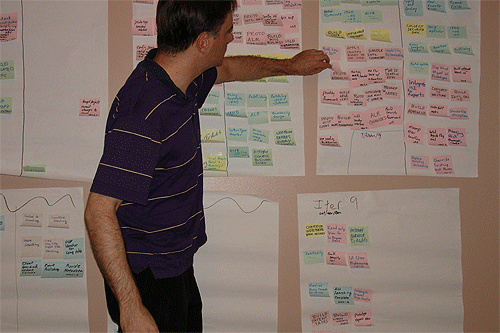
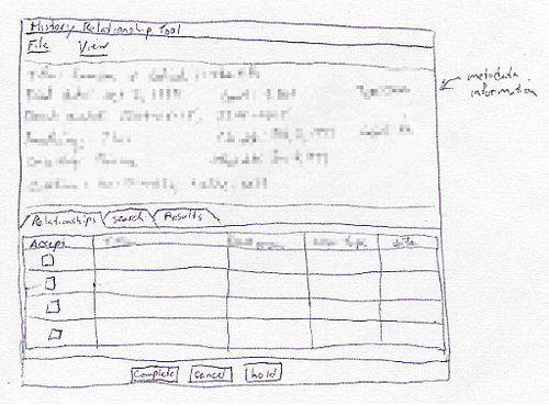
Once the iterations were established, I then performed field studies with all potential user groups, provided user questionnaires, performed task and user analysis, and used the vision and style guidelines developed earlier (see part 1 of the portfolio) to prepare to begin designing the interface. After these was accomplished I lead numerous brainstorming sessions and developed rapid prototypes via the whiteboard to establish interface designs for some of the primary functionality. These designs consisted of both snippets of functionality and, occasionally, entire screens.
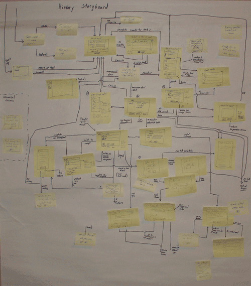
Once all interface snippets had been designed, I created a combination storyboard and interaction diagram to ensure we had captured the full user flow. This interface showed all of the user actions that could be performed within every screen, and helped also highlight several areas that had been missed in the earlier prototyping sessions. These missing pieces were then made the subject of additional sessions, and the entire storyboard was walked through.
During and following the development of the interaction diagram, the full functionality for the screens was being established. Rapid computer-based prototypes were developed and tested against user expectations and heuristics. These were developed in Visio, so were limited to a simple widget set. However, they were enough to give the users an idea of where the interface was heading, and to let them discover what worked and what didn't.
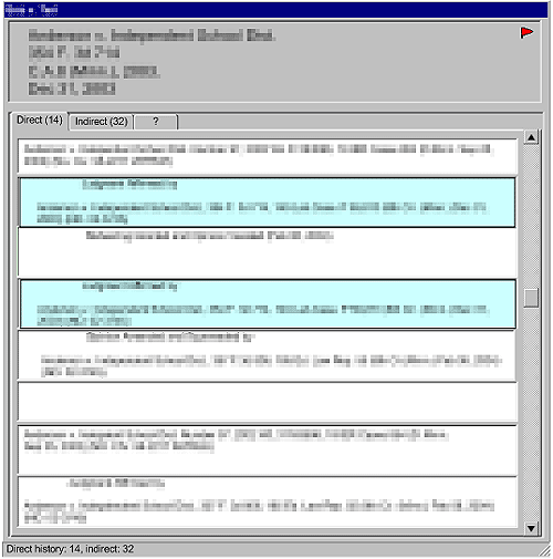
In this initial prototype, the users thought the delineated separation between sections was a bit jarring. They wanted an interface that had a better flow in the layout. They also wanted the phrases that connected the section to stand out more. The phrases had specific meanings and associated colors, so more color could be added to the interface in a meaningful way. As they saw the new interface and its capabilities forming, they also thought of some additional functionality that could be added that would help them further.
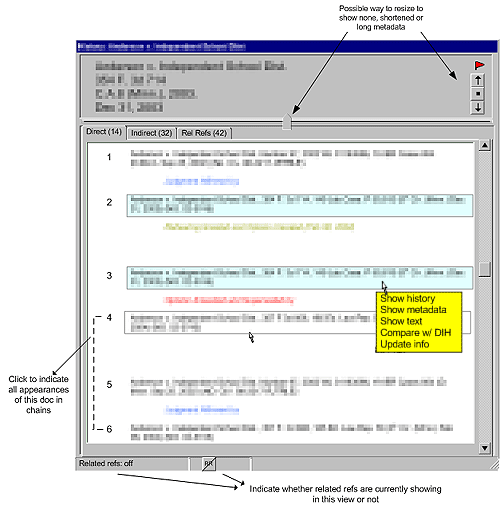
In the final interface, the additional functionality has been added. The
interface also lets the user know what mode they are in, and introduces
the colors that they wanted, which would help them find potential problems
in the relationships at a glance.
Using the prototypes as the guides, the designs were translated into the
final language (Java Server Faces with AJAX). As this was done, they were
further refined to use the advanced functionality available in custom-built
web application components, as well as to establish a consistent look.
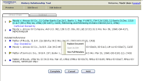
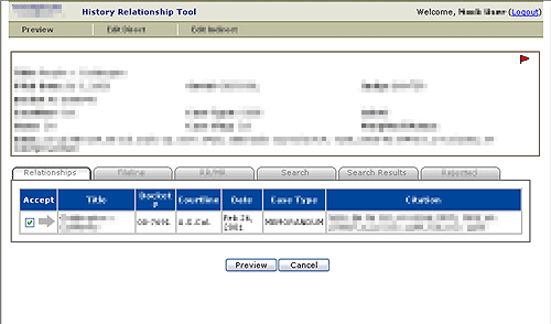
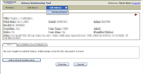
The final interface includes tabs that show alternate hidden panes. It also provides for drop down menus, and popup menus customized to each type of information (a document, a relationship, the flags, etc.).
While I have focused on the evolution of a single screen, there were dozens
of different screens within the application for each iteration. A few
of the others that were developed for the final application are also
included here:
